Hill
Country
Conservancy
This project is a redesign for the Hill Country Conservancy of Texas. Our goals were to makes the website more accessible and create a functional mobile browser website.
Role
UX Research
Web Design
Mobile Design
Time
3 Weeks
Tools
Figma, Figjam,
Slack, Google Drive,
Trello
Project Type
Desktop and mobile redesign


Design Challenge
The Hill Country Conservancy's website had many usability issues, such as navigation, finding how to volunteer as well as where to make donations and become a member.
User Research
We conducted 22 user and usability tests. In these tests we asked users if they understood the purpose of the original HCC website? Did they find it nice or pleasing to use? Did the website seem organized?

Problem
Users need a way to easily volunteer. The lack of clarification on the website makes it difficult when users are looking to get involved, which creates confusion causing users to feel frustrated. As a result, the HCC risks losing donations and volunteer prospects.
Solution
Upgrade the HCC design and user flow to improve the interface so that users will have an easier time giving back to the conservancy.
Original Design
The original HCC website had inconsistent design. The pages felt overwhelming and were confusing to navigate.


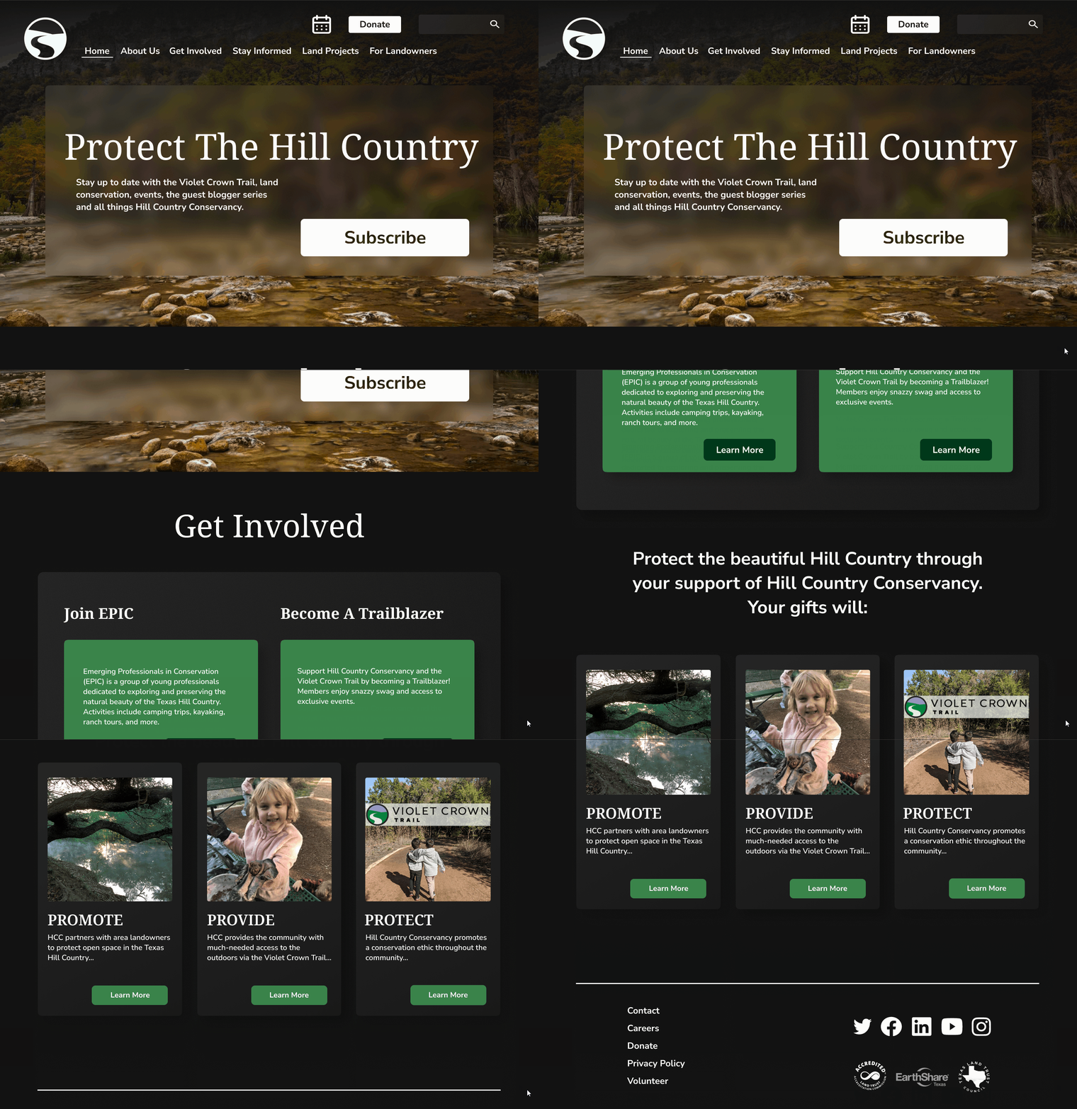
Redesign
We solved these issues by creating a consistent design that reflects the HCC ideals. We added CTA and clear, informative title pages.


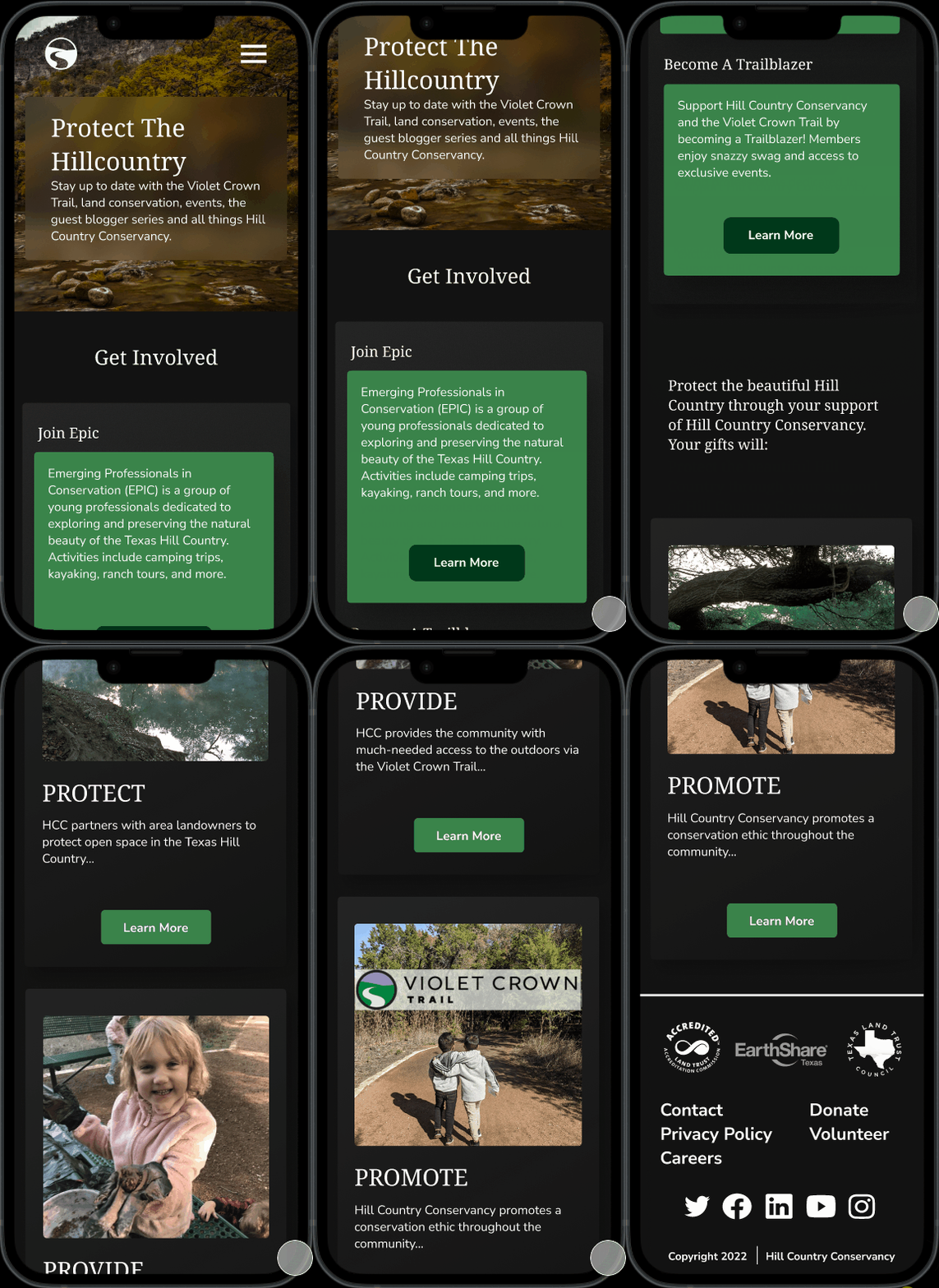
Mobile Redesign


User Experience
After completing the redesign we conducted further tests on the new user experience. To compare results we asked the same questions from testing the original website and saw significant improvement. Do you understand the purpose of the HCC website? Do you find it nice or pleasing to use? Does the website seem organized?
